1. Introduction: Why Printer Ink Colours Matter
In the world of printing, few elements are as fundamental yet often overlooked as printer ink colors. While it might seem straightforward – you press print, and a picture appears – the science and art behind those colors are incredibly complex and directly impact the final output quality of your documents and images. From the vibrancy of a cherished family photo to the professional consistency of a brand logo on marketing materials, the ink in your printer is the silent workhorse determining the success of your print job.
So, who should care deeply about printer ink colors? Essentially, anyone who prints!
Understanding Printer Ink Colours (Warna Tinta Printer)
Looking for information on warna tinta printer? This complete guide in English covers everything you need to know about printer ink colours and types.
- Home Users want their memories to look as good on paper as they do on screen, ensuring photos don’t look dull or off-color.
- Graphic Designers and Photographers rely on precise color reproduction to match client expectations and maintain their artistic vision.
- Business Users need consistent, accurate colors for branding, presentations, and client communications to maintain a professional image.
- Students benefit from clear, legible documents, especially when printing charts, graphs, or educational materials where color differentiation is key.
Understanding the nuances of ink colors can save you time, money, and frustration. This comprehensive guide will demystify the core concepts, from the fundamental differences between CMYK and RGB to the various ink types and how they collectively influence every aspect of your print quality. By the end, you’ll be equipped to make informed decisions that elevate your printing experience.
2. The Basics of Printer Ink Colours
To truly grasp how your printer renders images, we need to dive into the foundational color models that dictate how colors are seen on screens versus how they are printed on paper.
2.1 CMYK Explained (Cyan, Magenta, Yellow, Black)
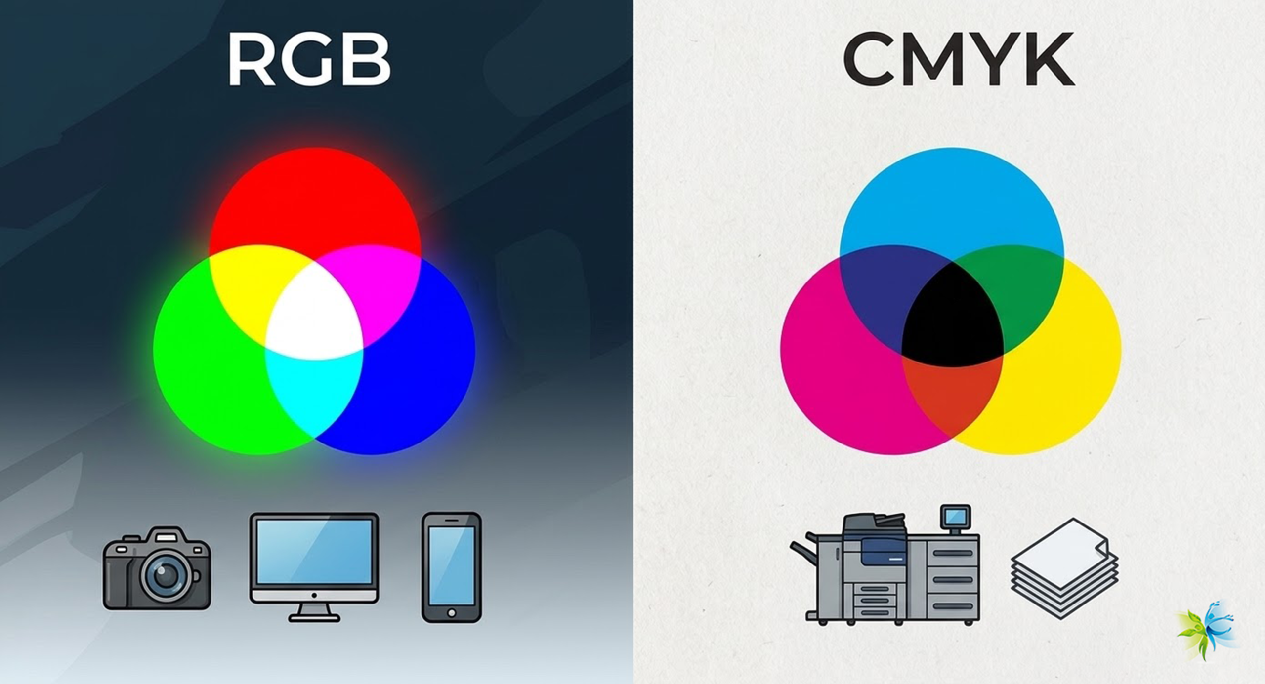
Printers operate on a subtractive color model, primarily using four ink colors: Cyan (C), Magenta (M), Yellow (Y), and Black (K). This quartet forms the acronym CMYK.
- Cyan: A bluish-green color.
- Magenta: A vibrant pinkish-red color.
- Yellow: A bright, pure yellow.
- Black (Key): Often referred to as “Key” because it’s the key plate in traditional printing, providing depth, contrast, and true black for text.
The “subtractive” part means that these inks work by absorbing certain wavelengths of light and reflecting others. When you mix them, they subtract more light, resulting in darker colors. For example:
- Cyan + Yellow = Green
- Magenta + Yellow = Red
- Cyan + Magenta = Blue
- All three (C+M+Y) theoretically combine to make black, but in reality, they produce a muddy brown. This is why K (Black) is crucial. It provides a true, rich black, adds depth, and saves on colored inks for darker shades and shadows.
Why don’t printers directly use Red, Green, and Blue (RGB)?
Printers don’t use RGB because RGB is an additive color model used by light-emitting devices like computer monitors, TVs, and phone screens. These devices create colors by adding varying intensities of red, green, and blue light. When all three are combined at full intensity, they produce white light. Since printers work with pigments on a reflective surface (paper) rather than emitting light, they need a system that subtracts light from the white background of the paper. CMYK is perfectly suited for this purpose, as it simulates how ink absorbs light.
2.2 RGB vs CMYK: What’s the Difference?
Understanding the fundamental difference between RGB and CMYK is paramount to avoiding color surprises between screen and print.
- RGB (Red, Green, Blue):
- Additive Colour Model: Creates colors by combining light.
- Used for: Digital displays (monitors, TVs, smartphones), digital cameras, scanners, and web graphics.
- Color Gamut: Generally has a wider color gamut (range of colors it can display) than CMYK, especially vibrant greens and blues.
- Light-based: Starts with black (no light) and adds light to create colors, reaching white when all three are at full intensity.
- CMYK (Cyan, Magenta, Yellow, Black):
- Subtractive Colour Model: Creates colors by absorbing light.
- Used for: All types of printing (desktop printers, commercial presses).
- Color Gamut: It has a narrower color gamut compared to RGB. This means some vibrant RGB colors simply cannot be accurately reproduced using CMYK inks.
- Pigment-based: Starts with white (paper) and adds inks to subtract light, resulting in black when all inks combine.
Why do screen displays and print results often look different?
The discrepancy between what you see on your screen and what comes out of your printer is a common frustration, primarily due to the RGB vs. CMYK difference.
- Different Colour Models: Your design software (like Photoshop) might display colors in RGB, but your printer converts them to CMYK. This conversion process, known as color space conversion, can lead to shifts, especially for vibrant colors that fall outside the CMYK gamut.
- Device Calibration: Monitors, printers, and even the paper you use each have their own unique “colour profile” (often an ICC profile) that describes their specific color characteristics. If your monitor isn’t calibrated, or your printer’s profile isn’t accurate, what you see on screen won’t precisely match the printed output.
- Lighting: Screen colors are self-illuminated, while printed colors are viewed under ambient light, which can vary greatly.
3. Different Types of Printer Ink Colour Systems
Beyond the basic CMYK model, printer inks come in various formulations and expanded color sets, each designed for specific purposes and offering distinct advantages.
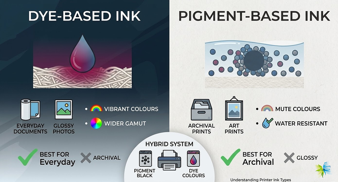
3.1 Dye-based vs Pigment-based Inks
The two main types of inkjet inks are distinguished by their chemical composition and how they interact with paper:
- Dye-based Inks:
- Composition: Colourants are fully dissolved in a liquid carrier (water or a solvent).
- Vibrancy: Known for their bright, vibrant colors and excellent saturation. They tend to produce a wider gamut of brilliant hues.
- Drying: Dry quickly and typically soak into the paper fibers.
- Durability: Less resistant to water, UV light, and fading over time compared to pigment inks. They can smudge when wet and fade when exposed to sunlight.
- Cost: Generally less expensive to produce.
- Best For: Every day documents and glossy photo prints where vibrancy is paramount and archival qualities are less critical. They are often found in consumer-grade photo printers due to their vibrant output on glossy photo paper.
- Pigment-based Inks:
- Composition: Colourants are tiny, solid particles suspended in a liquid carrier. These particles sit on the surface of the paper rather than soaking in.
- Vibrancy: Colours tend to be more muted but very stable and consistent.
- Drying: They can take slightly longer to dry as they need to adhere to the surface.
- Durability: Highly resistant to water, smudging, and UV light. They offer superior archival qualities, making them ideal for documents and photos intended to last for decades without fading.
- Cost: More expensive to produce due to the complex milling process required to create very fine pigment particles.
- Best For: Archival prints, professional documents, art prints, outdoor signage, and situations where longevity and water resistance are crucial. Many professional photo printers and business-oriented inkjet printers use pigment inks.
Some printers, particularly higher-end models, use a hybrid system, combining pigment black for sharp text with dye-based colors for vibrant images.
3.2 Photo Printers: Extra Ink Colours (Light Cyan, Light Magenta, Grey, etc)
While CMYK handles most printing tasks, dedicated photo printers often incorporate additional ink colors to achieve superior photo quality. These typically include:
- Light Cyan (LC) and Light Magenta (LM): These dilute versions of cyan and magenta allow for smoother color transitions and finer detail in lighter areas of images. This reduces graininess and banding, especially in skin tones and skies.
- Grey (G) or Light Grey (LG): These provide neutral grey tones, significantly improving the quality of black and white photographs by eliminating color casts and creating smoother monochromatic gradients.
- Red (R), Green (G), Blue (B), Orange (O), Violet (V): Some professional photo printers extend the gamut even further with these additional primary or secondary colors, allowing for a broader range of vibrant hues that fall outside the standard CMYK color space. This is particularly beneficial for reproducing corporate colors or highly saturated imagery.
- Photo Black (PK) and Matte Black (MK): Many photo printers include two black inks optimized for different paper types: Photo Black for glossy and semi-gloss papers and Matte Black for matte and fine art papers. This ensures optimal density and sharpness on various media.
Is it worth buying a photo printer with extra ink colors?
- Pros:
- Richer, More Accurate Colours: A wider color gamut means more lifelike and vibrant prints.
- Smoother Gradients: Light inks help eliminate banding and graininess in subtle color transitions.
- Superior Black & White Prints: Dedicated grey inks produce truly neutral and detailed monochrome images.
- Professional Quality Output: Essential for photographers, artists, and designers who need exhibition-quality prints.
- Cons:
- Higher Initial Cost: Photo printers with more ink tanks are generally more expensive.
- Higher Running Costs: You’ll need to buy more individual ink cartridges, increasing consumable costs.
- More Maintenance: More ink tanks can sometimes mean a higher chance of a nozzle clog if not used regularly.
If your primary use is printing high-quality photographs, fine art reproductions, or color-critical graphic designs, investing in a photo printer with expanded ink sets is worth it for the superior output. For occasional document printing, it might be overkill.
4. How Printer Ink Colours Affect Print Quality
The interaction of ink colors, printer technology, and paper choice creates the final print. Understanding this synergy is key to achieving optimal results.
Colour Accuracy
Color accuracy refers to how faithfully the printed colors match the intended colors (e.g., what you see on a calibrated screen or in a design file). It’s affected by:
- Ink Quality: High-quality inks have consistent pigmentation and chemical properties, leading to predictable color reproduction. Poor quality inks can lead to muddy colors or significant shifts.
- Printer Calibration: A properly calibrated printer applies ink precisely according to its internal color profile.
- ICC Profiles: These files describe the color characteristics of specific devices (monitors, scanners, printers) and specific paper types. Using the correct ICC profile for your printer, ink, and paper combination is crucial for accurate color management, allowing your software to correctly translate colors from your screen to your printer’s specific color space.
- Paper Choice: Different papers absorb and reflect light differently, affecting how colors appear.
Gradient and Detail Reproduction
The ability of a printer to reproduce smooth gradients (transitions from one color to another) and fine details is heavily influenced by ink colors and how they are dispensed:
- Ink Droplet Size: Printers with smaller ink droplet sizes can create finer details and smoother gradients.
- Number of Ink Colours: As discussed, printers with light cyan, light magenta, and grey inks excel at rendering subtle transitions and reducing graininess, particularly in skin tones, skies, and black & white images.
- Ink Formulation: High-quality inks are formulated to prevent “banding” (visible lines in gradients) and ensure even coverage, especially in large areas of solid color or subtle color shifts.
Impact of Paper on Colour Performance
The paper you print on is just as crucial as the ink itself. It acts as the canvas for your colors:
- Absorbency: Highly absorbent papers (like standard copier paper) can cause the ink to spread and colors to look duller or less sharp. Less absorbent, coated papers keep ink droplets on the surface, allowing for sharper images and more vibrant colors.
- Brightness and Whiteness: The inherent whiteness and brightness of the paper affect the perceived vibrancy and accuracy of the colors. A whiter paper provides a more neutral base for the inks.
- Coatings: Photo papers often have special coatings (e.g., glossy, semi-gloss, matte) that are designed to interact optimally with specific ink types (dye or pigment) to enhance color brilliance, sharpness, and durability. Using the wrong paper type for your ink can lead to poor results (e.g., a dye ink print on uncoated paper might look dull and be prone to smudging)
5. Common Issues Related to Ink Colours
Even with the right ink and paper, you might encounter issues. Understanding common problems can help you quickly diagnose and resolve them.
5.1 Colour Shifts / Inaccurate Colours
This is perhaps the most frustrating issue: your print doesn’t match what you saw.
Common causes of color shifts or inaccurate colors:
- Uncalibrated Monitor: Your screen’s colors might not be accurate, leading you to edit an image that already looks “wrong” about a standard.
- Incorrect/Missing ICC Profiles: If your software or printer driver isn’t using the correct ICC profile for your specific printer, ink, and paper combination, color translation will be off.
- Low Ink Levels: When one or more ink cartridges are running low, the printer may struggle to produce the correct color mixtures, leading to noticeable shifts or faded areas.
- Incorrect Printer Settings: Generic printer settings (e.g., “Plain Paper” selected for photo prints) can lead to poor color reproduction because the printer applies ink sub-optimally.
- Environmental Factors: Lighting in your viewing environment can make colors appear different.
- Third-Party Ink Incompatibility: The lower quality or incompatible third-party inks might not have the same color characteristics as the original manufacturer’s inks, leading to unpredictable shifts.
How to correct color shifts:
- Calibrate Your Monitor: Use a hardware colorimeter to calibrate your display regularly. This ensures your screen is displaying colors accurately.
- Use Proper ICC Profiles: Ensure you’re using the correct ICC profile for your specific printer, ink, and paper type. Many paper manufacturers provide these for download. In your design software (e.g., Photoshop) and printer driver settings, specify the correct profile.
- Update Printer Driver: Ensure your printer driver is up-to-date. Manufacturers often release updates that improve color management.
- Check Ink Levels: Always ensure you have sufficient ink in all cartridges.
- Select Correct Paper Type in Driver: Match the paper type selected in your printer driver settings to the actual paper you are using (e.g., “Epson Premium Glossy Photo Paper”).
- Perform Nozzle Check and Head Cleaning: Sometimes, a minor clog can cause color shifts by preventing a specific color from being laid down correctly.
5.2 Missing Colours or Faded Prints
These issues often point to problems with ink delivery.
Common causes of missing colors or faded prints:
- Clogged Print Heads: The most common culprit. Ink can dry and accumulate in the tiny nozzles of the print head, blocking ink flow. This leads to streaks, missing lines, or the complete absence of certain colors.
- Empty Ink Cartridges: Obvious, but worth checking. If a color is completely missing, the cartridge might be empty.
- Air Bubbles in Ink Lines: If ink lines aren’t properly primed or if cartridges are refilled incorrectly, air can get trapped, preventing ink flow.
- Expired or Degraded Ink: Old or improperly stored ink can degrade, affecting its flow properties and color vibrancy.
- Incorrect Printer Settings: Printing in “Draft” mode or with “Ink Saving” options enabled can result in lighter, faded prints.
Using the printer’s self-diagnosis tools:
Most modern inkjet printers have built-in maintenance utilities:
- Nozzle Check: This utility prints a test pattern that shows if all nozzles are firing correctly for each color. If there are breaks or missing lines in the pattern, it indicates a clog.
- Print Head Cleaning: If the nozzle check reveals clogs, run the print head cleaning utility (sometimes called “head cleaning” or “deep cleaning”). This forces ink through the nozzles to clear obstructions. You might need to run this a few times.
- Print Head Alignment: If prints appear blurry or misaligned, the print head might need alignment. This utility prints patterns that help you manually or automatically adjust the print head position for optimal clarity. Access these tools through your printer’s control panel or, more commonly, through your computer’s printer driver software.
6. Choosing the Right Ink Colours for Your Printer
Making the right ink choice is crucial for both print quality and your wallet.
Genuine Cartridges vs. Third-Party Cartridges (Colour Performance, Cost, Safety)
This is a recurring debate for printer owners.
- Genuine (OEM – Original Equipment Manufacturer) Cartridges:
- Pros: Designed specifically for your printer, offering guaranteed compatibility, optimal color accuracy, consistency, and reliability. They use high-quality ink formulations that are less likely to clog print heads and maintain the printer warranty.
- Cons: Significantly more expensive.
- Verdict: Best for critical applications (professional photos, client presentations) or if you prioritize reliability and peace of mind above all else.
- Third-Party (Compatible/Remanufactured) Cartridges:
- Pros: Much more affordable, offering significant cost savings.
- Cons:
- Color Performance: Varies widely. Some high-quality third-party inks can come close to OEM, but many result in noticeable color shifts, reduced vibrancy, or poor durability.
- Safety/Reliability: This can be a gamble. Lower-quality inks may contain impurities that clog print heads, potentially damaging your printer and voiding your warranty. They might also lead to smudging or fading.
- Verdict: Suitable for general document printing where color accuracy isn’t paramount or if you’re on a very tight budget and willing to accept potential risks. If you do go this route, research reputable third-party brands with good reviews.
How to Choose Ink According to Your Printing Needs: Documents, Photos, Graphics, etc.
Your specific printing needs should drive your ink choice:
- For Everyday Documents (Text-heavy):
- Ink Type: Pigment-based black ink is ideal for crisp, sharp text that resists smudging and fading. Color vibrancy is less critical here.
- Printer: Standard inkjet printers with a good pigment black cartridge.
- Paper: Standard plain paper.
- Ink Choice: Cost-effective genuine or high-quality compatible cartridges focusing on black.
- For High-Quality Photos:
- Ink Type: Dye-based inks are often preferred for their vibrancy and gloss on photo paper. For archival photos, pigment-based inks offer superior longevity and fade resistance. Printers with additional light inks (LC, LM, G) are highly recommended.
- Printer: Dedicated photo printers with multiple ink cartridges.
- Paper: Glossy, semi-gloss, or matte photo paper specifically designed for inkjet printing.
- Ink Choice: Genuine photo-specific inks are highly recommended for optimal results and to protect your investment in expensive photo paper.
- For Graphics and Presentations:
- Ink Type: A balance of vibrancy and durability. Pigment-based inks are generally a good choice for graphics that need to withstand handling and light exposure.
- Printer: Business-oriented inkjet printers that offer good color fidelity.
- Paper: Presentation paper or heavier-weight uncoated or matte papers that can handle ink saturation without bleed-through.
- Ink Choice: Genuine inks for important presentations to ensure brand consistency. For internal drafts, high-quality, compatible inks might suffice.
- For Archival Prints (Art Prints, Important Documents):
- Ink Type: Exclusively pigment-based inks, known for their longevity and resistance to fading, moisture, and smudging.
- Printer: Professional photo or fine art printers designed for archival output.
- Paper: Acid-free, archival-grade fine art papers specifically coated for inkjet printing.
- Ink Choice: Genuine pigment inks from the printer manufacturer are virtually a must for archival purposes to ensure maximum longevity and color stability.
7. Tips for Maintaining Colour Quality Over Time
Once you’ve chosen your ink, proper maintenance is key to ensuring consistent color quality throughout the life of your printer and your prints.
Regular Printing vs. Ink Drying
- The Golden Rule: Use your printer regularly! Inkjet printers are designed to be used consistently. If left idle for extended periods (weeks or months), the ink in the print head nozzles can dry out and clog, leading to missing colors or streaky prints.
- Simple Solution: Print a small, multi-color test page or even just a full-color document once a week or every couple of weeks. This keeps the ink flowing through the print head.
Print Head Maintenance Advice
- Utilize Built-in Cleaning Cycles: If you notice print quality issues (streaks, missing lines, color shifts), first use your printer’s built-in print head cleaning utility. Access this through your printer’s control panel or your computer’s printer driver. Run it 1-2 times, then perform a nozzle check. Avoid excessive cleaning cycles, as they consume a lot of ink.
- Avoid Manual Cleaning (Unless Necessary): Unless you are experienced and using manufacturer-approved methods and cleaning solutions, avoid manually cleaning the print head. These are delicate components easily damaged.
- Proper Shutdown: Always power off your printer using its dedicated power button. This ensures the print head is “parked” in a sealed position, which helps prevent ink from drying out.
Environmental Impact on Cartridge Storage (Temperature, Humidity)
How you store your ink cartridges (and even your paper) can significantly impact their performance and longevity:
- Temperature: Store ink cartridges in a cool, dark place. Extreme temperatures (both hot and cold) can affect ink viscosity and chemical stability. Avoid direct sunlight.
- Humidity: Keep cartridges in a dry environment. High humidity can introduce moisture into the ink or affect print head performance. Low humidity can contribute to ink drying out.
- Original Packaging: Keep unused cartridges sealed in their original packaging until ready to use. This protects them from air exposure, light, and contaminants.
- Orientation: Store cartridges upright or as indicated by the manufacturer to prevent leaks or air bubbles from forming in critical areas.
8. Printer Ink Colours in Professional Use
For professionals, color is not just about aesthetics; it’s about accuracy, consistency, and brand integrity.
Commercial Printing Requirements for Colour Consistency
In commercial settings (e.g., graphic design studios, marketing agencies, and photography businesses), color consistency is paramount.
- Brand Identity: Companies invest heavily in their brand colors. Every piece of collateral – from business cards to brochures – must accurately reflect these colors to maintain brand recognition and professionalism.
- Client Expectations: Clients expect their designs to look identical across different media and print runs. Inconsistent colors lead to dissatisfaction and costly reprints.
- Proofing: Accurate color matching in proofing (small runs for client approval) ensures that the final larger print run will meet expectations.
Achieving this requires a meticulously managed color workflow.
Professional Colour Calibration Workflow
A robust color calibration workflow is essential for professional users:
- Monitor Calibration: Regularly calibrate your display using a hardware colorimeter to ensure that what you see on screen is accurate. This is the starting point for any color-managed workflow.
- Printer Profiling: Create custom ICC profiles for your specific printer, ink, and paper combinations using a spectrophotometer. These profiles accurately describe how your printer will render colors on different media. While generic profiles come with drivers, custom profiles offer superior accuracy.
- Software Colour Management: Use design software (e.g., Adobe Photoshop, Illustrator, InDesign) that supports color management. Assign correct RGB profiles for your images and ensure proper CMYK profiles are used for printing, allowing for accurate soft proofing (simulating print output on screen).
- Controlled Viewing Environment: View prints under standardized lighting conditions (e.g., D50 illuminant) to eliminate ambient light biases.
Recommended Tools (Colorimeter, ICC Profiles, RIP Software)
- Colorimeter/Spectrophotometer:
- Colorimeter: Used for calibrating monitors. Measures the light emitted from a display.
- Spectrophotometer: A more advanced tool for calibrating monitors, creating custom ICC profiles for printers and scanners, and measuring printed colors. It measures the reflected light from a surface. Essential for professional-level color accuracy.
- Examples: X-Rite i1Display Pro, Datacolor SpyderX (colorimeters), X-Rite i1Pro, Barbieri (spectrophotometers).
- ICC Profiles: These are small data files that describe a device’s color characteristics. They are the backbone of a color-managed workflow, enabling consistent color translation across different devices.
- RIP (Raster Image Processor) Software: For high-volume or specialized printing (e.g., large format, fine art, textile), RIP software provides advanced control over ink laydown, color management, and print quality, often offering better results than standard printer drivers. It’s crucial for managing expanded ink sets and achieving precise color consistency.
9. Frequently Asked Questions (FAQ)
Here are answers to some of the most common questions regarding printer ink colors.
How to choose ink for Epson i3200 or XP600 heads?
Focus on filtration & fluidity. Winnerjet 2026 inks use 3-level nano-filtration to ensure smooth flow and zero clogging for high-speed i3200/XP600 heads.
Can I mix printer ink colors myself?
No, absolutely not. Printer inks are precisely formulated with specific chemical properties, pigment/dye concentrations, and viscosities. Mixing different ink types or even different brands of the “same” color can lead to chemical reactions, clogging, permanent damage to your print head, and unpredictable color results. Always use compatible ink types and brands as intended by the manufacturer or reputable third-party suppliers.
Do black and white prints require color ink?
For truly neutral, rich black and white prints, yes, often they do. While your printer has a dedicated black ink cartridge, most inkjet printers use a “composite black” for images, which is created by mixing small amounts of CMY ink along with black ink. This helps to create smoother tones and reduce graininess. Dedicated photo printers often have additional grey inks specifically for superior black-and-white output, providing a wider tonal range and eliminating color casts. So, even if you’re printing in grayscale, ensure your color cartridges aren’t empty, especially if printing images.
Why do grays print red/blue?
When grey tones appear with a color cast (e.g., reddish or bluish), it’s usually due to:
- ICC Profile Mismatch: The color profile being used doesn’t accurately describe how your printer/ink/paper combination renders neutral greys.
- Uncalibrated Monitor: Your screen might be displaying a neutral grey, but it’s tinted, leading you to compensate incorrectly in your design.
- Ink Imbalance: The printer’s internal color mixing for composite black/grey might be slightly off due to minor clogs, low ink, or variations in third-party ink formulations.
- Ambient Lighting: The light under which you view the print can have a color cast itself, influencing your perception of the grey.
What are the standard warna tinta printer (printer ink colours)?
For best results, use correct ICC profiles. Winnerjet provides custom ICC profile support for our bulk ink customers to ensure color accuracy.
Do you offer wholesale pricing for CMYK + White + Varnish?
Yes. We offer bulk rates and a “2026 Pre-pay & Lock” program to hedge against rising costs. Orders are fulfilled quickly via our USA warehouse.
10. Conclusion
Understanding printer ink colors is far more than just knowing what CMYK stands for. It’s about grasping the fundamental principles of color reproduction, recognizing the impact of different ink types and paper choices, and mastering the subtle art of color management. This knowledge empowers you, whether you’re a home user printing cherished memories, a student aiming for clear study materials, a business professional maintaining brand consistency, or a graphic designer delivering client-ready projects.
From the vibrancy of dye-based inks to the archival qualities of pigment inks and the expanded gamut of photo printers, each choice directly influences your print quality. Armed with insights into common issues like color shifts and print head maintenance, you can troubleshoot effectively and extend the life of your equipment. For professionals, the journey continues into sophisticated calibration and profiling, ensuring unwavering color accuracy in a demanding environment.
Ultimately, your printer’s ink is the heart of its ability to bring your digital creations to life. By making informed choices about your inks and adopting best practices for their use and maintenance, you can unlock the full potential of your printer, ensuring every page you print is a true reflection of your vision.